Stack & methods
Try it: live Walch classifier
This is the actual trained model, exported to run entirely in your browser: no server, no upload, nothing leaves your device. Drag the six CT-derived measurements (or load a reference case) and watch it walk the hierarchy: healthy-vs-diseased first, then the main erosion type, then the subtype.
Control inputs
Readout
loading model…
Where the data comes from
A teaching assistant in my biomechanics course handed me a dataset of real patients and asked whether I could build something useful from it. That is the whole origin of this project: one spreadsheet, and a question.
The dataset is 143 patients' shoulders. For each one, ten geometric measurements of the glenoid, the shallow socket the arm bone sits in, were taken from a CT scan of the shoulder: how the socket is tilted (version and inclination), how far the ball of the joint has drifted off-center (subluxation), and its surface area, curvature, and depth. Every patient also arrives already labelled with its type, using the Walch system that surgeons use to describe how a socket has worn. So the model learns from measurements plus the correct answer for 143 people, and it never sees anything else: no images, no names, nothing but those numbers. Because the measurements came pre-recorded and pre-labelled, the real engineering was choosing which of the ten actually matter and teaching a staged model to reason from them the way a clinician would.
Data provenance
3 sources
Pipeline
- Pick the signal
- Engineer 2 ratios
- 6 model inputs
Approach
Hierarchical classifier
- 6 inputsCT-derived
- Engineer featuresclinical ratios
- Tier 1normal? · AUC 0.98
- Tier 2type A / B / E
- Tier 3subtype
- Walch type+ confidence
The classifier is hierarchical. Tier 1 separates Normal from Pathologic glenoids. Tier 2 assigns the main type among A, B, and E. Tier 3 resolves the subtype: B2 vs B3, E2 vs E3, with A mapping directly to A2 (the only A subtype in the data). I compared Random Forests, SVMs, XGBoost, and logistic regression at each tier and kept the strongest per stage.
Domain-grounded feature engineering. From four measured inputs (version, inclination, and anterior-posterior / superior-inferior subluxation) plus glenoid surface area and sphere radius, the pipeline derives a subluxation index and an area-to-radius ratio. Encoding subluxation and version as vectors and ratios, rather than raw numbers, hands the models the geometry a surgeon actually reads off the scan. An ANOVA confirmed subluxation and version were the most discriminative measurements (F ≈ 40, p < 1e-18).
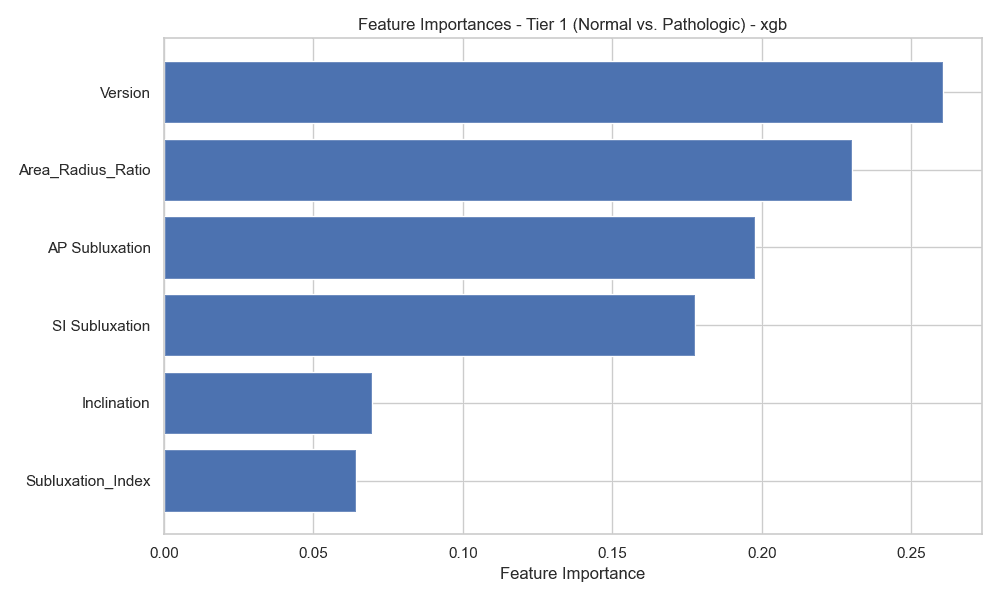
What drives the healthy-vs-diseased screen: version leads, followed by the engineered area-to-radius ratio and the subluxation measures, confirming the geometry the feature engineering was built around.
Problem
The Walch classification is the standard framework orthopedic surgeons use to describe how a glenoid (the shoulder's socket) has eroded and deformed in arthritis, and it directly drives how a shoulder replacement is planned. Assigning a Walch type is normally a manual, expertise-dependent read of a CT scan. This project asks a narrower, tractable question: can a small set of quantitative, CT-derived measurements be mapped automatically onto the Walch types?
It pairs naturally with my peer-reviewed hip-arthroplasty work as a second musculoskeletal-ML piece: same instinct of turning clinical measurements into a decision-support tool.
My role
Solo work. I built the data preparation and feature engineering, the three-tier model stack, and two delivery front-ends: a Streamlit web app and a terminal tool. For this portfolio I went a step further and re-exported the trained model to run natively in the browser above, so the classifier isn't just described: it's runnable.
Results, and an honest look at the numbers
The strongest, most reproducible result is the healthy-vs-diseased screen: Normal vs Pathologic reaches ~91% accuracy with an AUC of 0.98. That's the tier I trust most, and it's the one a triage tool would lean on.
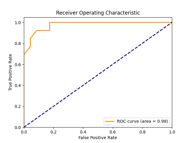
Tier 1: Normal vs Pathologic. AUC 0.98: the healthy-vs-diseased screen separates cleanly, and this reproduces under proper cross-validation.
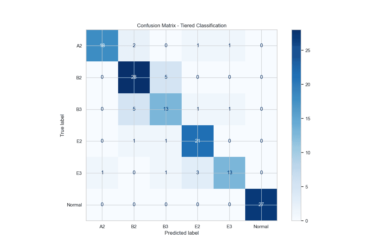
The full 6-way confusion matrix from the report: 120/143 correct (83.9%). Normal is perfect and the errors cluster where they should clinically: B2↔B3 and E2↔E3.
NOTE: Per-tier 84% vs. end-to-end 63%: the honest read
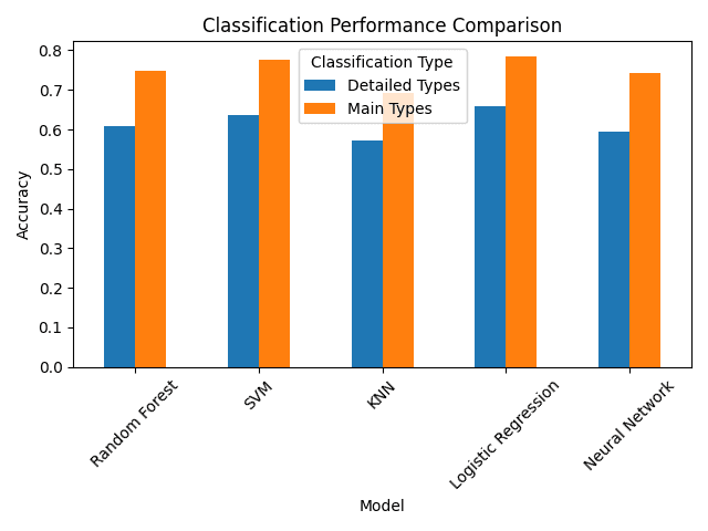
Why tier at all: a single flat classifier tops out around 78% on main types and ~64% on the full detailed types. Breaking the problem into staged decisions is what makes the healthy-vs-diseased screen so strong.
Tech stack
Languages
- Python
- TypeScript (in-browser inference)
ML & Modeling
- scikit-learn
- Random Forest
- XGBoost
- SVM
Data & Delivery
- pandas · NumPy
- Streamlit
Reflection
Two things I'm proud of here. The structure: a hierarchical classifier that decomposes a hard six-way problem into the same normal → type → subtype decisions a clinician makes, each stage matched to a model that suits it. And the honesty: catching that the headline 84% is a per-tier number, reporting the ~63% a deployed tool actually achieves, and then shipping that deployed tool so anyone can poke at it. A small dataset (143 cases, some subtypes under 20 examples) is a real limit, but naming the limits, and making the model checkable, is the point.